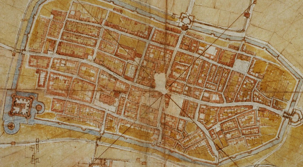
The 16th Century Satellite Map of da Vinci
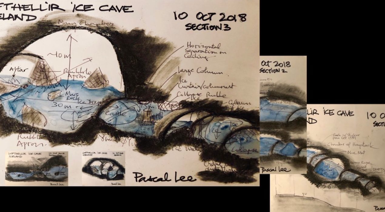
Mapping a Lava Ice Tube – 3/24/19


Map of My Heart – 2/14/19


Old Survey Maps Get A New Life – 2/13/19
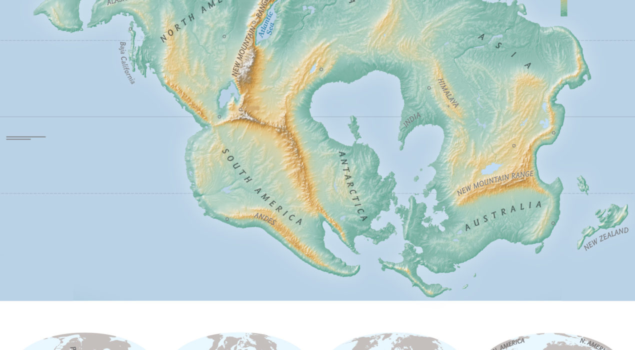
Where Will You Be in 250 Million Years? – 2/12/19
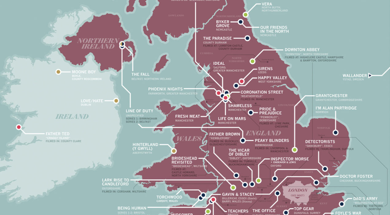
Map of Your Favorite British TV Show Settings – 2/11/19


